
Client: City of Cincinnati Metropolitan Sewer District
Project: Brand Identity and Design for Efficiency
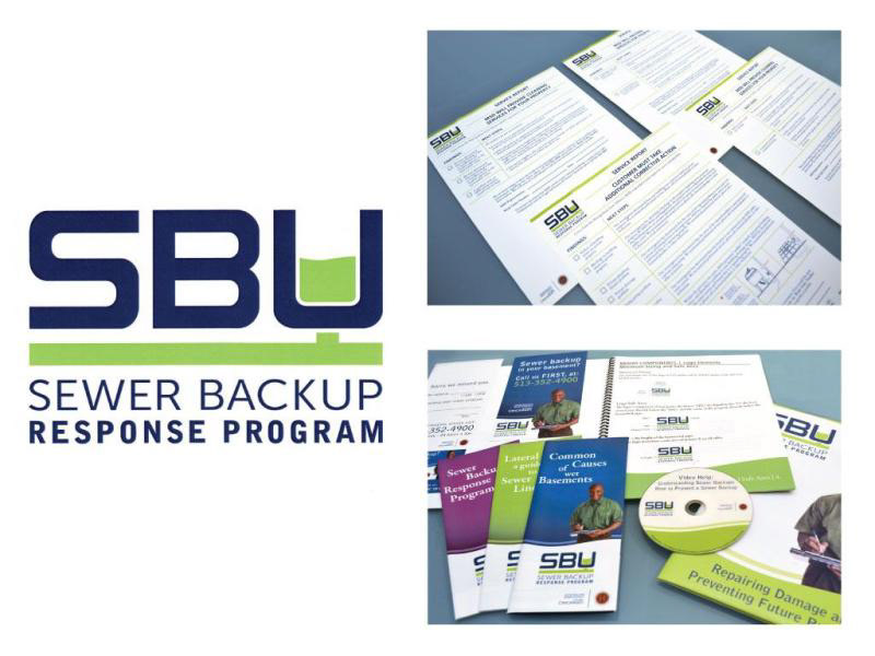
Role: Design Direction
Challenge: Directed student teams specializing in branding and print design as part of a large, multidisciplinary project encompassing graphic design, audio/video production, and web development. The objective was to develop a cohesive visual identity for the Metropolitan Sewer District’s Sewer Backup (SBU) team, along with supporting marketing materials and operational forms, while improving workflows for employees responding to sewer backup incidents.
Under my guidance, the team designed a new SBU logo aligned with the established brand standards of the City of Cincinnati and the Metropolitan Sewer District. The new design incorporates approved color palettes and motion characteristics to ensure visual consistency across agencies.
Through field interviews with MSD employees, our team identified pain points, inefficiencies, and missed opportunities within the existing customer and employee experience. These insights informed the creation of a comprehensive, customer-centered branded system that begins before an incident occurs. Initial touchpoints included a redesigned refrigerator magnet and door hanger, replacing ineffective legacy materials. These were supported by issue-specific brochures and explanatory videos that helped homeowners understand the situation and navigate available options with greater clarity.
On the operational side, the team developed a streamlined suite of branded forms tailored to specific service scenarios. This system reduced redundant paperwork, improved information relevance for homeowners, and significantly shortened on-site visit times, enabling technicians to serve more customers efficiently while maintaining a consistent, professional brand experience.